Brand Development Strategy
A Complete Guide.
Two of the most frequent questions we get asked are “What is a brand?” & “What is brand development?”
These are great questions (“What is a brand?” & “What is brand development?). And we shall begin by answering the first question. What is a brand? Is it a logo? A color-scheme? Is it the words you say or the photos you use?
It’s all of the above, and yet none of them singularly. A brand is a desired perception, and to create a favorable perception of your business in customers’ minds, all the components must work harmoniously together.
But creating a perception isn’t as simple as saying “This is who I am and this is what you should think of me.” Crafting this perception requires you to deeply understand your business, your customers, and yourself.
That’s why this report isn’t just an explanation of the 7 components that constitute a great brand but also includes the questions you need to answer to build each component as you work through the brand development process.
If you take the time and thoughtfully answer the questions proposed at the end of each component section, you will have the answers you need to develop the brand, and in turn, the company of your desires.
Now, let’s get to what is brand development…
The 7 Components of a Great Brand:
- 01. Logos
- 02. Color
- 03. Fonts & Typography
- 04. Imagery
- 05. Voice
- 06. Design
- 07. Positioning
Brand Development 101:
01
Logos
First Impressions Last A Life Time.
As humans, we have always used symbols to express our individuality and sense of pride. In most cases, these symbols represent our loyalty. These also signal a sense of ownership.
While many logos are seemingly simplistic and obvious, the process of creating a powerful logo can be elusive. It can also be undermined, particularly when there’s no strategic thought built into its formation.
Many branding agencies will tell you that your brand is much more than a logo, which is accurate.
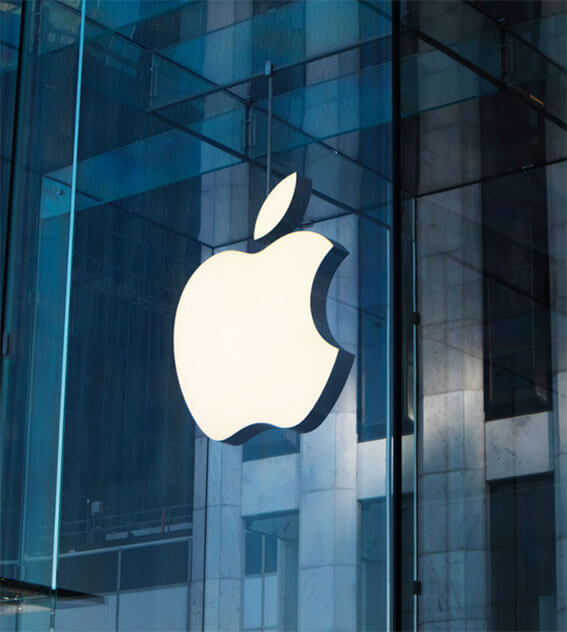
However, that does not mean your logo isn’t important. In fact, your logo is typically the first visual expression a person will experience when interacting with your company. And, since first impressions last a lifetime, your logo (much like every aspect of your brand) is a powerful and instrumental tool in establishing your mark in the business world.
There is one tip to remember when it comes to logo and logo design:
Don’t place ALL the pressure and responsibility to communicate everything about the brand in your logo.
Broadly speaking, there are 5 different types of logos, ranging from literal, word-driven, and conceptually simple to symbolic, image-driven, and conceptually complex:
There’s no right or wrong logo, as long as it’s intentional and attracts the ideal clientele or customers.
Check Out Our Related Blog Posts:
Logo Design: Don’t Take Chances!
Hey, What Do You Think Of My Logo?
Extending Your Brand Beyond Your Logo
There are three responses to a piece of design – yes, no, and WOW! Wow is the one to aim for.
– Milton Glaser
Brand Development Tools:
- On the spectrum of logotypes, do you want a logo to be more literal or conceptual?
- What’s the most important story to be communicated in the logo?
- Is your brand story better told by serif, sans serif, or script fonts for the logo font?
- Does your logo have the right hierarchy of information? In other words, is the emphasis placed on the right words or symbols?
- What do you want people to remember about your logo?
- What type of logo will appeal to my ideal target audience?
- How can my logo stand out from my competitors?
- Where will the logo live?
- Am I making sure the logo will stand out whether it’s online or in print?
Color creates emotion, triggers memory, and gives sensation.
– Gael Towey, Creative Director,
Martha Stewart Living Omnimedia
Brand Development 101:
02
Color
The Brain Reads Color Before It Reads Content.
Did you know that 60-90% of the reason why we buy products is based on color?
While there are many critical components to building a powerful brand, color should not be ignored, given this statistic. Quite the opposite actually, it says a lot about us and is critically important.
There’s a tremendous amount of theory and psychology around color, and it’s important to know that different colors appeal to different people.
For Example:
- Why do you think fast food companies, such as McDonald’s, In-and-Out Burger, Burger King, and Wendy’s, use red in their branding? It has been proven that the color red stimulates our appetite —no wonder why people feel hungry when just merely seeing their branding.
- Or, why do you think JetBlue uses blue in its branding? Aside from having blue in their brand name, they know blue is a calming and soothing color. If there’s one emotion you want to feel when on a plane, it’s undoubtedly helpful to feel calm and relaxed.
In short, in the sequence of visual perception, the brain reads color before it reads content. Ignore this at your own peril.
Check Out Our Related Blog Posts:
Branding and Colors: Can Pink Be Masculine?
How To Find a Color That Matches Your Personality
Differentiate: Color is not always the most effective way.
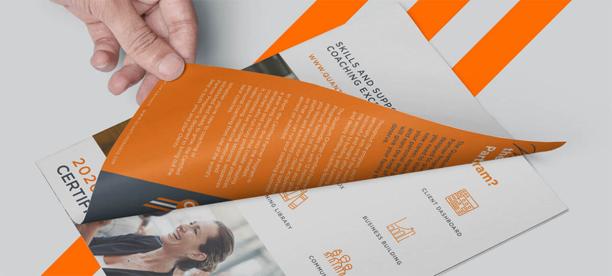
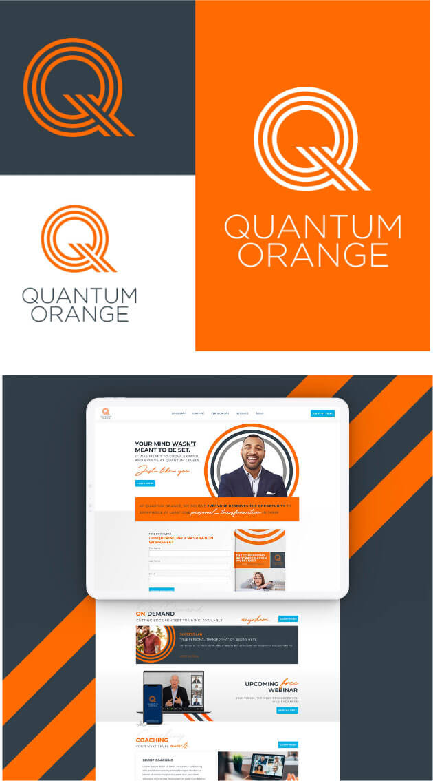
In our recent rebrand for the Australian-based personal development company, Quantum Orange, we used, you guessed it, orange as it symbolizes enthusiasm and emotion.
Brand Development Tools:
- Is your brand attempting to own a singular color? Or a range of colors?
- Are your colors consistent across various media and marketing channels?
- Have you tested your brand colors on different surfaces or applications?
- Is your brand better off using warm or cool colors?
- Does your color system use complementary colors, hues, tints, or shades?
- Have you researched and evaluated the connotations and meanings of your brand colors in different countries and cultures?
- Are you choosing color based to create meaning, add depth, or tell a story? Or are the colors chosen simply because you “like” them?
- Will your color system be flexible enough to allow for a range of dynamic applications?
- Are you using color in a strategic way to support your brand architecture?
- Have you evaluated the pros and cons of using color to differentiate products, business verticals, or simply categories of information?
- Do you need a bold color palette or pastel palette?
- Can you reproduce your brand colors?
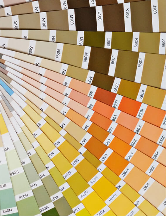
- Do you have color specifications for Pantone, RGB, CMYK and Web?
- Have you “named” your colors?
Brand Development 101:
03
Typography
Fonts are often overlooked as touchpoints for cohesive branding.
Typeface and fonts portray a personality, and personality can distinguish between being perceived as a mass-market brand or a high-end, premium brand.
Have you ever looked for a listing of typefaces and fonts by personality or wanted to know which ones are best for communicating different messages?
They are often overlooked as touchpoints for cohesive branding. As a result, many entrepreneurs select the same fonts and typefaces as their competitors. In other cases, they’re chosen haphazardly and not based on any criteria or reasoning.
The most important thing to consider when looking at a font to match your brand’s personality and messaging is the history of the typeface and what it is commonly associated with.
Anyone can easily discern how the public generally views a font by looking into what it has been used to communicate over time. Just like we associate cowboy hats with the wild west, so too do we associate calligraphy with antiquity.
Another quality to look for when picking the right outfit for your text is the font’s design!
Is it bold, sloppy, geometric, or curvy? Each of these attributes has associated connotations, so use them to your advantage and create a comprehensive brand experience by choosing wisely!
Check Out Our Related Blog Posts:
Fonts by personality. How to find yours!
Font Ownership: Do you own your font?
Type is magical. It not only communicates a word’s information, but it conveys a subliminal message.
– Erik Spiekermann, author Stop Stealing Sheep.
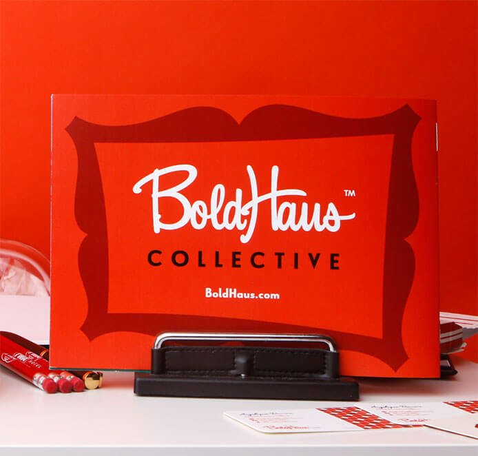
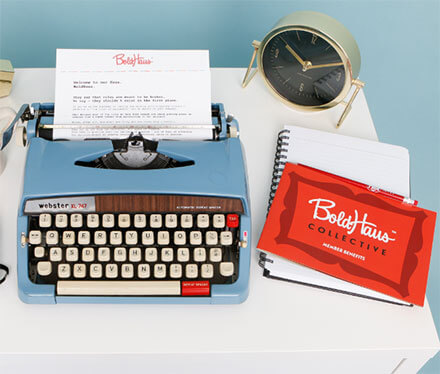
Check out how we rebranded the consulting firm BoldHaus utilizing a sophisticated font to create a breakthrough premium brand.
Brand Development Tools:
- Are your fonts distinctive in the category? If you’re using commonly available fonts, are you losing an opportunity to be memorable?
- How many fonts are you using in your branding? Are you using more than 3 fonts (We recommend 2-3 maximum)?
- Is your font industry-specific? In other words, the type of font for a classic romance movie would be different from a font for a mysterious horror movie.
- What are the top 3 personality characteristics that your font represents? Example: forward-thinking, daring, conservative, modern, classic.
- Are you using fonts consistently throughout your visual system? For example, are you using fonts consistently in font size, font weight for headlines, body copy & call-to-actions?
- Is the typeface legible?
- Does the typeface family complement the logo or brand identity?
- (ADVANCED) Does the typeface include letters, numerals, and bullets?
- (INDUSTRY-SPECIFIC) Are you meeting compliance requirements regarding type size?

Creating visual imagery is a state of mind. It involves the reproduction of what we see. But much more than that, it becomes an outlet to express feelings about what we experience.
– Tracy Sabin
Brand Development 101:
04
Imagery
They say a picture is worth 1,000 words.
They also say a video is worth a million words. So whether you’re using photography, video, or illustrations in your branding, the overall objective here is to tell a story.
What is the story you’re telling with imagery?
What is the personality of the imagery that best represents that story?
How do you want people to “feel” when they view your photos, videos, and illustrations?
Check Out Our Related Blog Posts:
Stop cheapening your brand with literal photography
Stock Photography Vs Real Imagery? Which Converts Better?
How to Use Stock Photos (and Get Away With It)
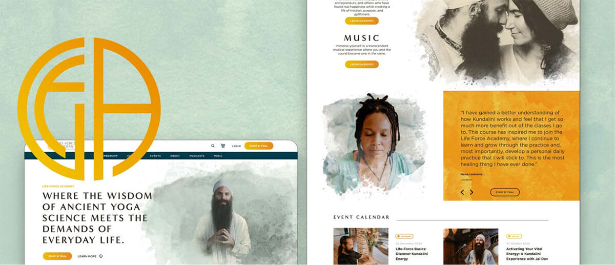
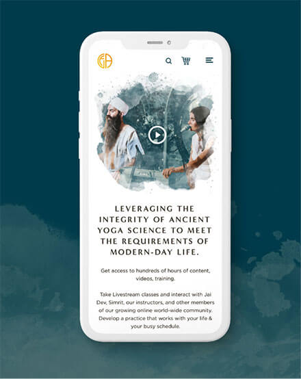
When we re-branded The Life-Force Academy, the world’s premier home Kundalini Yoga experience, imagery was a key factor (from lifestyle photography to special, unique icons and images). Check out their brand.
Brand Development Tools:
- Do you incorporate at least 2-3 categories of images: professional images of you, personal images displaying your personality, and customer/client images?
- If you’re using stock photography, are these images popularly downloaded or more obscure?
- Are you using “benefit-oriented” images?
- Are you using the right image for the communication or message?
- Do you have a healthy mix of conceptually-based and literal-based images?
- Is your imagery consistent throughout your entire online and offline presence?
- Is there a common story that threads all images?
- Ask a professional colleague or ideal client to tell you how they feel when they look at your images on your branding. Are you happy with their response?

Brand Development 101:
05
Voice
A strong brand has a clear personality.
This next component is on Brand Voice, also known as your personality.
Think Apple vs. Dell. Or iPhone vs. Android.
A brand either attracts your raving fans (or repels your non-ideal customers or clients).
Ellen Degeneres and Rosie O’Donnell are both talk show hosts. But, they have two distinct voices of their brand.
Do you think that a Harley Davidson salesperson would like it if a rabid Volvo fan walked into their showroom and started asking a bunch of go-nowhere questions about the safety features on a Harley Softail Fat Boy Lo model motorcycle?
What kind of look do you think a Starbucks lover would get if they happened to go into Dunkin Donuts early one morning and ask for an Iced, Half Caff, Ristretto, Venti, 4-Pump, Sugar-Free, Cinnamon, Dolce Soy Skinny Latte?
So, does your brand have a voice? In other words, does it have a personality? And more importantly, do you like it?
Check Out Our Related Blog Posts:
Developing Your Brand Voice
Brand Voice: It’s not what you say, it’s how you say it

Nike didn’t discover the power of advertising, Nike discovered the power of their own voice.
– Dan Wielden
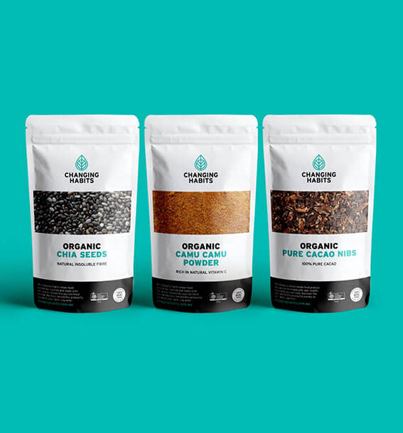
While rebranding the Australian-based health company Changing Habits, creating a powerful, yet polarizing voice was key for them.

Brand Development Tools:
- What 5 words describe your personality.
- Review your photos and videos and ask yourself: do these 3-5 personality adjectives come through loud and clear?
- Now try the same thing with your headlines and body copy. Review them and ask yourself: Are these 3-5 personality adjectives represented in the language?
- Is your voice consistent across all of your communication touch-points?
- Is your voice distinct in the industry in which your business operates?
Design Is Thinking Made Visual.
– Saul Bass
Brand Development 101:
06
Design
Now, we’re going to make a bold statement here. We may piss off some people with this statement.
But, as we described in the previous component, having a strong Brand Voice is key to attracting ideal clients and customers. At Branding For The People, we’re no different. Our tribe KNOWS that design matters, and they have an affinity towards high-design and aesthetics.
80% of business owners do not have a solid sense of design when it comes to branding.
You could say it’s the reason why branding agencies and graphic designers exist. It’s also why we have fashion stylists, interior designers, image consultants, and the like.
Design is highly subjective, but it’s more important for the design to be effective and powerful.
Is the design of your brand done in a way that enhances the delivery of the information and experience?
Check Out Our Related Blog Posts:
Branding and Design: What’s the Difference?
Top 10 Website Design Mistakes to Avoid
Tips to Avoid a Design Frankenstein
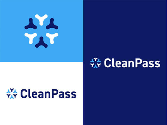
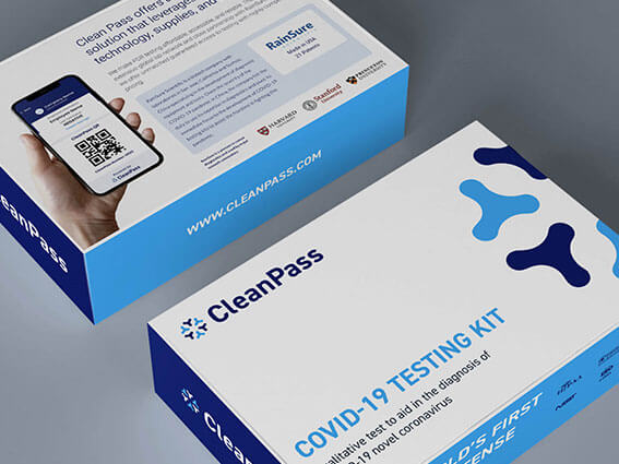
A great example of form meeting function can be seen in our recent branding endeavor for CleanPass. Simple, elegant, and easy to follow was at the core of this project’s criteria.
Herman Miller, the Michigan based, American Modernist inspired furniture company is at the top of the heap when it comes to approaching absolutely every touchpoint with high-minded modernity and ease of use. Their website, furniture, and magazine all reinforce the fact that they believe in quality through simplicity. Nothing is out of place, and everything has a reason: we couldn’t be any more comfortable than sitting in their chairs or browsing their beautiful products in showrooms or online.
Systematic design of information alleviates many pain points when deciding what to put where, and it helps clients understand your business better. For example, once you are clear on who you are and how you sell what you sell, the structure of the information you are communicating should be sorted out easily.
Brand Development Tools:
- Do the overall design and layout aid in communicating your brand voice and message?
- Do you have a system for taking a lead and nurturing it into a sale?
- Is the layout of your brand done in a way that enhances the delivery of the information and experience?
- Is your design consistent across various marketing channels and communication touch-points?
- Do your major revenue generators occupy the most real estate in your marketing materials?
Brand Development 101:
07
Positioning
Congratulations on making it this far!
Please bear with us on this last one (it’s a little longer than the others). Why?
Because it’s probably THE most important tool in building a successful and influential brand.
It’s called your Brand Positioning.
One of the best ways to explain this concept is to use our branding agency as an example (we like to be an example because we believe in the “practicing what you preach” approach).
In the chart to the right, we mapped out where our branding agency is “positioned” relative to other branding agencies:
On the left upper left quadrant, there are firms that target Fortune 500 companies and are highly strategic and holistic in their branding approach.
On the bottom left quadrant, there are branding agencies that also target Fortune 500 companies but they are more specialized and tactical in nature.
When it comes to branding agencies (or resources) who serve entrepreneurs and small businesses, the resources available vary — from crowdsourcing, virtual assistants, and the “friend” or “relative” who does graphics. Unless the people behind these resources come from a Fortune 500 branding background, they’re more specialized and tactical (in our view).
Check Out Our Related Blog Posts:
The Positioning Statement: What Is it & How to Write One
Celebrity Branding & Taylor Swift’s “brand positioning”

The basic approach of positioning is not to create something new and different, but to manipulate what’s already in the mind, to retie the connections that already exist.
– Al Ries & Jack Trout. Authors of Positioning, The Battle For Your Mind.
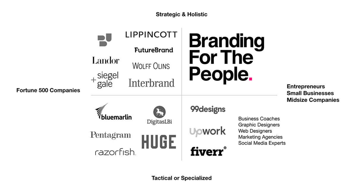
Now, to be fair, there’s a place for all of these resources for entrepreneurs and small-to-midsize businesses. In fact, we’ve referred prospects and clients to these resources on occasion, BUT for very specific and tactical needs.
At, Branding For The People, our position is in the upper right quadrant — which means we bring a highly strategic and holistic approach to branding for entrepreneurs and small-to-midsize businesses.
- It’s why we’re not a logo shop.
- It’s why we don’t brand every single entrepreneur and small business.
- It’s why we work with emerging entrepreneurs and established small businesses.
Ask yourself these questions:
- Who are your target audiences?
- What is the problem you solve?
- Why should people listen to you?
- What makes you a credible company or person?
- What differentiates you?


