
- Pink CAN be masculine
- Orange CAN be luxurious
- Blue CAN be fun
How? Context matters.
First, let’s understand the purpose of a color palette.
In terms of branding and colors, a color palete is a selection of colors and color schemes that provides a visual tone for your brand — that “look and feel” you want to express visually. When anywhere from 62 to 90% of a target audience’s decision is based upon color alone, there’s significance to selecting colors based upon the perception you want to create.
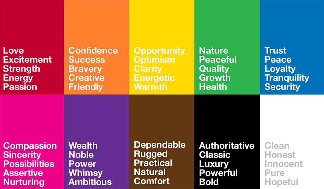
So if the palette helps establish that tone, then we need to understand consumer perceptions of colors by personality.
So what are the expectations for colors by personality?
Determining colors by personality has to integrate a complicated mix of perceptions and cultural experiences. Even if the study of color psychology lacks formal, scientific data, one need only consider a sampling of global perspectives on color (such as here, or here) to realize that these perceptions do exist. Still, articulating a steadfast rule on colors may be as tricky as throwing a dart up against a dartboard.
Thankfully, you don’t need a scientific study on color to use it in branding. We know, from our individual experiences, that target audiences are influenced by color.
We know, from our own experiences, that certain target audiences associate particular views with specific colors: why else do so many Americans paint a girl’s nursery pink?
So in branding and colors, rather than relying on indisputable proof or rules about colors by personality, use known predictions and expectations about your target audience to shape and create the perception you want for your brand. It’s less about the color itself and more about the context of your positioning and your target audience. That context is how you can shape color personality so orange can be luxurious.
Let’s consider some common expectations around colors by personality:
Now let’s compare these expectations with some actual logos:
![]()
Do you see a connection? Does this explain why PayPal uses blue? Why Whole Foods uses green? Those logos and color choices may feel almost stereotypical, like painting a nursery blue for a boy.
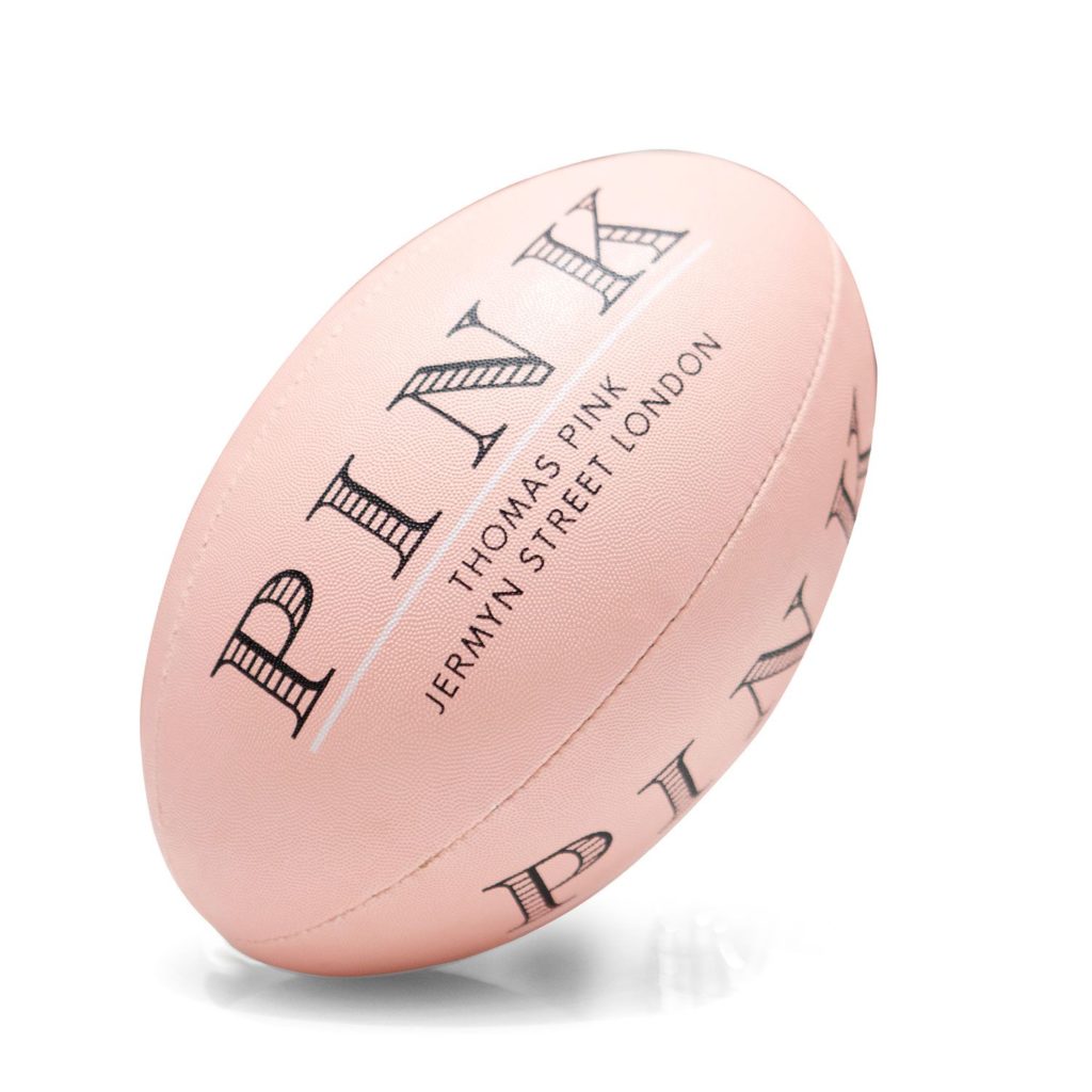
But did you notice something else, perhaps a little bit unexpected? Hint: British Petroleum and Whole Foods both use green. Here’s another: compare Harley Davidson’s orange with Hermes. Still, think pink is feminine? You must not be part of The Pink Lion Rugby Club.
Why would an oil company and a grocery store both use green?
Why would motorcycles and handbags both use orange?
These brands are playing off predictions around your expectations and in some instances challenging them. As part of their effort to draw you in. When the inspiration for Thomas Pink is “contradiction with a dash of cunning,” no wonder the luxury brand uses the color pink. On a rugby ball.
Still don’t get orange for luxury?
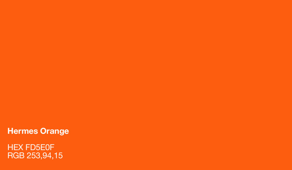
You aren’t alone. Yet, Hermes is highly successful: in 2015, among major luxury brands, it returned the highest after-tax profit in 13 of 15 years. According to more than one blog source, its orange boxes stem from a WW2 shortage of paperboard supplies. The color stuck, now rooted in a tradition much younger than the 180-year-old company. Specifically, according to at least one writer, bold, visibility, and tradition are the perceptions that Hermes uses to target consumers.
We agree, and posit that it isn’t very far off from the same perceptions that Harley Davidson uses in connecting with its very-different-but-just-as bold target audience.
The question of color personality takes us back to something we consistently raise: your positioning in the market. Color is significant. But you cannot pick a color based on a rule book. It must be part of a well-analyzed visual and verbal identity so that you understand the context and circumstances in which your brand operates.
That is how you make blue fun, orange, luxurious, and pink masculine. What other ways can your brand play with expectations of colors by personality?
If your brand has taken you as far it can go, there’s only one way to take it further. It’s not with a marketing agency. Not with a business coach. Not even a graphic designer. It is with a branding agency. We’d love to help.


