Decades of being well-known for its iconic blue and pink logo, Baskin Robbins unveiled its new look. The new design appears to be a tribute to its original 1947 logo, using the original pink and brown colors and slab serif font. The previous logo was iconic as the “BR” monogram contained the figures “3” and “1” at the center of the emblem, a nod to the 31 flavors slogan that differentiated them in its early years. The new logo maintained this treatment despite the company now having more than 1,000 flavors.
Why would this multinational ice cream brand decide to rebrand after 16 years?
Our speculation is to create a more dynamic Brand System that lends itself well to different marketing collateral.
What is dynamic branding?
Dynamic branding is defined as branding that can showcase opportunities for change, has movement, versatility and flexibility. Some may refer to these as “Living Brands” because they physically change or move, reflecting the very definition of dynamism. In the case of Baskin Robbins, their rebrand has implemented a range of patterns with new colors that make it easy to apply and implement to packaging, interior within their storefronts, and for the first time ever -merchandise. This year Baskin Robbins is looking to sell branded merchandise such as caps, clothing, beach towels, even bikes and skateboards.
How do you add dynamic qualities to your brand?
1. Add a range of colors to your color palette:
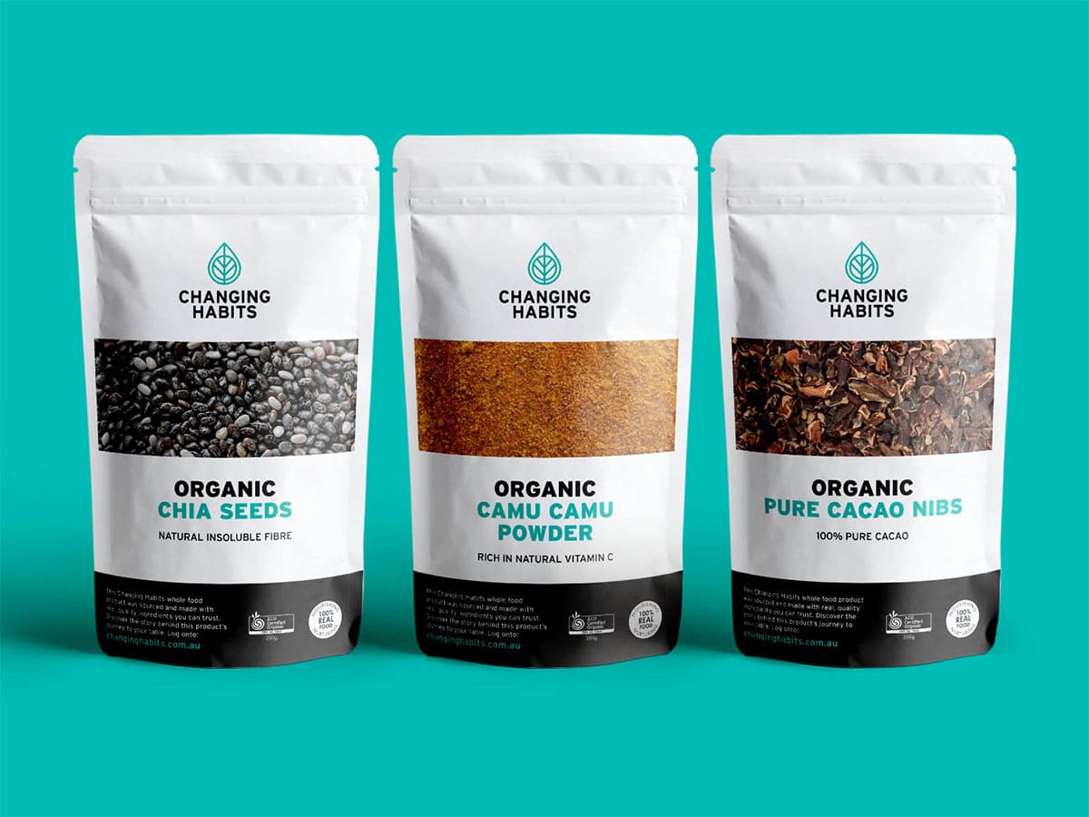
One of our past clients, Changing Habits, noticed their branding was beginning to visually fall flat. Changing Habits is an Australian-based company that is literally changing people’s eating habits through their whole food products, coaching programs, and online nutrition academy. Their list of products was growing so quickly that the products were becoming visually disjointed. Branding For The People’s mission was to unify Changing Habit’s various product lines and programs under a singular dynamic Branding System. We identified their primary color palette, and created a secondary color palette that they could utilize specific products. As a result of their partnership with Branding For The People, Changing Habits has reported an increase in sales in their whole food product line. Their new brand even won GDUSA’s brand and product packaging design award in the Health and Wellness category.
2. Adding Patterns/Gradients
Including gradients or patterns can make your brand identity extremely versatile. They can make a bold or subtle statement in the background. Having a range of colors and gradients can also help differentiate between products. Take our client Odyssey Test Prep, they are an LSAT tutoring and prep company that helps law students raise their LSAT scores on the path to getting into the law school of their dreams. We created a pattern that used their extensive color palette in different combinations which made it easy to apply to a variety of workbooks and other study materials.
3. Adding Graphic Elements
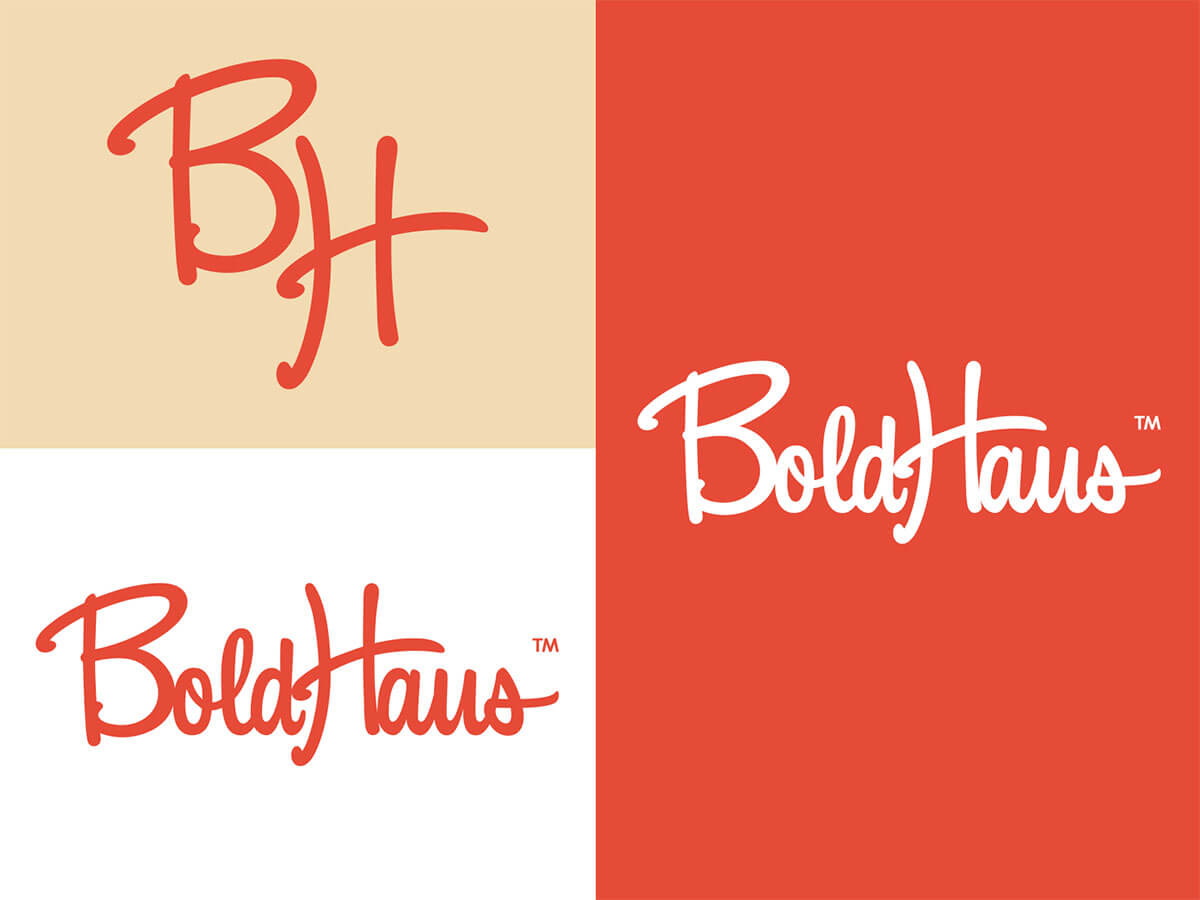
Graphic elements are a key part of our branding process, it’s what differentiates your business from the competition. Establishing a set of graphic elements can complete the overall look and feel of your brand and if used consistently, can help build brand recognition. For instance, our client Angelique Rewers at BoldHaus came to us wanting to create a brand that was brazen, disruptive, and different from anyone else in their industry. Inspired by retro design, mid-century modern and 007. We used unique iconography with a vintage feel to create a fun and dynamic brand.
As we like to say, Branding is more than just your logo; If your business is lacking a dynamic Branding System and you are ready to talk about a rebrand, let’s chat.


