When it comes to the creating a “visual language” for your brand, color is one of most powerful components of your brand that allows customers or clients to distinguish you from the crowd. Colors are what most people notice when they see your logo, website, marketing materials or product packaging. It’s usually what resonates in their memory and what reminds them of your brand. Knowing all of this, it make sense that you should take your time when choosing the color that will represent you and your company. In doing so, you will position yourself as a company that people want do support, recommend or follow.
Color theory is a fascinating study. In fact, numerous studies demonstrate the power of color in branding. And, we’re talking about more than just the simple color associations with adjectives, e.g., red = passion, white = purity.
The power of colors is a deeper exploration. For example, not all colors work well with all types of industries. The sophistication and timelessness of the color black might work well for the automobile industry but would hurt companies in the food industry. Think about it — who would buy food from McDonald’s if their dominant branding colors were black and grey? In the food industry, black stops signifying sophistication and starts signifying that the specific company’s food might be rotten. Now, to be clear, I’m not promoting fast food chains, but I want to illustrate how brands are using color to appeal to consumers.
Entrepreneurs and small businesses can also leverage color theory to create brands that will help them build a bigger business and make bigger impact with people. Just keep in mind that color can symbolize and signify who you are, what you stand for, and why people should care about you. However, you must do your research. You might be surprised by how many colors don’t work well with different industries.
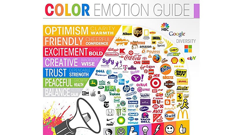
I love the ‘True Colors’ infographic by Column Five Media which explains colors reflect a brand’s image and alters consumers’ perceptions. They have a fascinating study what your brand colors say about your business — what the colors signify, what industries work well with certain colors (and what industries aren’t appropriate for certain colors). Note: you should recognize that perceptions of colors are oftentimes subjective – people’s feelings about particular colors can be personal and rooted in their own experiences. However, there are also many colors that have universal meaning. As you can see, the infographic points out some interesting statistics. For example, 33% of the world’s Top 100 brands use BLUE as their brand color. Why? You could say that blue makes companies look more trustworthy, dependable, and responsible. These traits work well for many different industries, more than any other color – blue is the only color that is popular for six different industries.
Another interesting statistic highlighted in this infographic is that a resounding 95% use only one or two colors for their brand. That is because using more than two colors will usually confuse most consumers, it will make it harder for them to remember the brand and there will be much less situations in which consumers will stumble upon the same combination of colors. For example, when people see the combination of red and yellow, they will be instantly reminded of McDonalds.
When done properly, I would encourage entrepreneurs and small brands to either own one color, two colors, OR even explore a multi-color system as part of your visual language. For example, Google and eBay use a few different colors, but the colors work well with one another and they are consistent about how they use these colors in their branding.
When deciding which colors to use for your brand, you must also consider geographic considerations. Most color studies relate mostly to North America and the United Kingdom. If you’re a national or locally based brand, this may be less relevant. It’s worthwhile to note that, especially if you plan to be an international brand, if your product is sold in a different country you should check to see if there are any color associations that have negative meanings or might be offensive in another country.
If colors don’t seem powerful enough by now, here’s more: colors can affect a person’s state of mind, their cognitive ability and can even cause physiological reactions! Some colors, for example, can raise a person’s blood pressure, increase their metabolism or cause eyestrain. In ancient times, the Chinese, Egyptians and other cultures used colors to heal people of different problems. This type of therapy is called “Chromotherapy” and is still used today as a holistic and alternative treatment. You might not believe it works but if it does one thing it shows how important colors are in our lives and how much of an impact they have.
To summarize, I want you to be aware of the power of colors in our lives and in your businesses. Don’t underestimate that the colors you use to build your website, your marketing materials, social media posts, or even the colors of your clothes ALL have an impact on people’s perception of you.
But, the real question for you to explore:
ARE YOU CHOOSING COLORS THAT ARE CREATING THE DESIRED PERCEPTION THAT IS MAKING A DIFFERENCE IN BUILDING YOUR BRAND AND BUSINESS?


