Welcome to the internet’s most unofficial (yet honest!) ranking of the Top 7 Brands of 2015.
We at BRANDING FOR THE PEOPLE believe that in order to build a fantastic brand you’ve got to have 7 consistent components including Logo, Colors, Fonts, Imagery, Voice, Overall Design and Extrapolated Brand Positioning. So, in this vein, we have selected one exceptional company as a stand out representation of how to do each of these things right. Feast your eyes on the best of the best as curated for you, by us!
Logo & Logo Usage
Logos can be judged against many design criteria, none are good or bad as long as they are intentional. The multinational big brand that we believe has the most intentionally designed logo is Amazon.Com. Why? Well, it may not be pretty, but it certainly communicates the promise behind the brand! Amazon delivers everything from A to Z, with a smile, and you can find this entire story (and more) within the simply designed components of their logo!

Brand Colors
Are your colors reading to your audience the way that you want them to? Do they differentiate you from all of your competitors, while delivering on the promise behind your brand? Mayne companies try to make color work for them, to separate them from their crowded markets, only to be let down by the final result which is usually nothing short of garishly executed (yes, Payless, we are talking about you, the 70’s are over and mixing those colors with those fonts and shapes is bringing back bad style with a vengeance!). However, every now and then a company comes along that uses color to perfection, and the winner of Best Brand Colors is, by far, Hermès of Paris. Why? Well, it takes a lot of refinement and style to make a color like orange look luxurious, yet Hermès does it with aplomb. How do they do it? Well, they pair it with clean lines, and classically elegant design that mimics the Toile patterns that the French countryside is famous for, all while being bold and memorable.

Fonts & Typography
Are your fonts detracting from your brand? Are they uniform? Do they match other components? This question seems to escape designers of logos all across the country, and the world. Far too often we see designers that are simply afraid to insert “too much” personality into the logos and the brands that they design. There are several companies that we would like to mention as stand-out representations of fantastic font design. The first, and most ubiquitous, Coca-Cola, needs no introduction, but perhaps it is only famous because it is famous. The next, another large multinational has put more thought into their type-treatment than most. It is a company that makes machines, very big machines, designed to power our planet, and clean our clothes, and all of this awesome power is artfully demonstrated in their logo. The company in question is GE, and they have the 4th most recognized brand in the world. The logo itself expertly marries motion inducing graphics with timeless, equally dynamic fonts. However, where GE lacks is in its application of brand boosting fonts and typography across its entire system! They may have had their own headline font created specifically for their company, but it doesn’t carry the memorability that such an expenditure should provide. Have you seen their headline font? It isn’t exactly exciting. So, which company wins? That is EASY! With the perfect marriage of a logo font that truly backs up their message of wisdom, longevity and worldliness, and body copy fonts that are famous in their own right for the same, this year’s Fonts & Typography award goes to none other than The New York Times.

Imagery: Photography, Videos, Illustrations
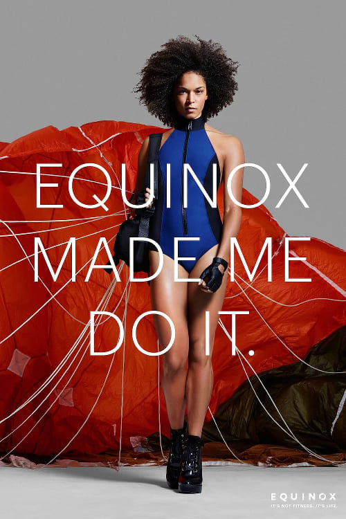
Uniformity of photography and imagery is often overlooked, yet uniformity provides a brand with the opportunity to make a point: to elicit a feeling and drive it home into the heart of a client over and over again. If the imagery behind a brand isn’t consistent, it creates confusion, and can appear moody, and certainly not trustworthy. If your photos are dark one day, and bright the next, you are robbing your clients of the opportunity to familiarize themselves with the overall disposition of your brand. Equinox fitness is this year’s winner for overall best imagery. Here is a sampling of their recent advertising campaigns. If you’ve ever been to one of their clubs, you would agree that their aggressively luxurious branding is carried out in every touch point possible!
Brand Voice:
Does your company have a relatable personality? Is it uniform and consistent with all touch points? Virgin America has both of these things in spades, and that is why they are our winner in the Brand Voice category for 2015. Their voice, their promise to “make flying good again,” and their commitment to the entire process is evident from the moment you visit their website to the moment you step off of their plane after landing at your destination. Not only are the words that they use such as “Where would you like to go?” more welcoming than the commonplace “Book Now” or boring “Find Flights” of their competitors, but their every message is indicative of being lead on a journey by the best airline in the class. They are friendly and welcoming with new planes, leather seats and entertainment on-demand at every seat, and have won “Best Domestic Airline” in both Condé Nast Traveler and Travel + Leisure magazine for the last 7 consecutive years.

Overall Design:
Is the design of your brand done in a way that enhances the delivery of the information and experience? Herman Miller, the Michigan based, American Modernist inspired furniture company is at the top of the heap when it comes to approaching absolutely every touch point with high minded modernity and ease of use. Their website, their furniture and their magazine all reinforce the fact that they believe in quality through simplicity. Nothing is out of place, and everything has a reason: we couldn’t be any more comfortable than when we are sitting in their chairs or browsing their beautiful products in showrooms or online.

Extrapolated Brand Positioning:
Does your brand and your company occupy a distinctive position in the market, and is it branded consistently? Let us put the question to you another way… Is there anything about the Harley Davidson brand that is confusing in any way at all? No, we thought not, and that is why they win for having the most distinctive brand positioning of 2015 (and perhaps for the last 112 years as well!) If you are wondering why we didn’t say Apple, well, we could have, but we just chose not to! We think that Harley’s ability to carve out their own little slice of Americana has been remarkable, and they do it across all touch points including Logo, colors, messaging, imagery, fonts and overall design layout and information hierarchy.

Thanks for reviewing our rankings, and we hope that you enjoyed our opinions! If you’d like to nominate a brand or two for our upcoming “Best Small Business Brands of 2015” please Contact Us.


