How To Create A Branding System? We often get asked, “What do you think of my logo?” And it’s a fair question, but not one that can be answered just be viewing the logo.
You see, a brand is more than just a logo. It is a system. You can’t judge a logo in a vacuum any more than you can judge a pair of shoes without seeing the outfit they are going to be paired with. Objectively, your Jimmy Choos are stunning, but they aren’t the shoes to wear when going to the gym and they sure don’t match the gym shorts and Nike tights you are wearing.
Branding is like your entire outfit. Every individual piece needs to make sense together and present a uniform look and feel.
And like a good outfit, the individual pieces can be simple, boring even. Yet when combined present a cohesive, unique look and message.
Below is an example of how to create a branding system from a company we recently re-branded called Triumpha.
Triumpha is a HR consulting agency to Fortune 500 companies. And in the stuffy world of HR they needed a brand that stood out from the corporate look, communicated their unique ability to transform the culture of their clients’ businesses, and appealed to high level executives who are the decision makers that represent their client base.
1. Logo
The logo is simple. Triumpha in helvetica. Helvetica was chosen for its simplicity and is actually more common than you might think. It’s used in the logos of BMW, Jeep, American and FedEx to name a few and we used it in all caps and bolded for a simple bold statement. It’s quite boring when viewed on its own, but that is why we don’t just create logos, we create visual systems.
2. Color
The visual system starts to take shape when we add color to the logo. The color system is vibrant, bringing personality to an otherwise bland wordmark. The gradation also changes, communicating the transformation that Triumpha delivers.
3. Messaging
Triumpha’s messaging was developed to speak to the high level executives that define Triumpha’s core market. They are the decision makers at large corporations and as such understand the importance of leadership and decision-making. The messaging, including the manifesto above speak to this core belief of Triumpha’s target clients.
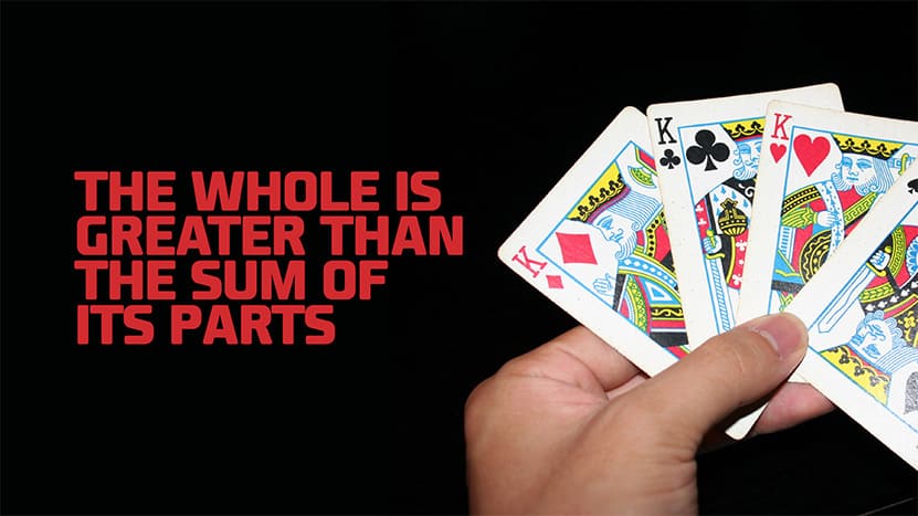
Individually, the logo, colors and messaging aren’t eye-catching, but together they create a look, feel and message that is ideal for Triumpha’s market. A great brand is a culmination of its individual components that when combined create a cohesive verbal and visual identity. When building your brand don’t put all the responsibility of your brand on any one component, but rather build a system that makes an impact.


