“Less is more.” – Ludwig Mies van der Rohe
Considered by many to be the “unofficial mission statement for minimalist design,” it is often considered to be the guiding principle for minimalism movement that has taken the world by storm in recent years .
It is the desire to remove clutter from our everyday lives.
It is Marie Kondo, urging all of us to get rid of all the things we don’t need and focus on the power of simplicity.
It Is a slick modern phone, a simple interface, or even a clean car.
Minimalism has gone mainstream, and it seems the movement has caught up even in the business industry as many companies started stripping down their branding to the purest possible form.
In the world of design, a push for minimalism makes sense.
Take this passage from Guity Novin’s Online Textbook, The History of Graphic Design,
“The aim of graphic design is to elucidate a specific visual message and communicate it to a wide range of audiences. Given that the capacity of various communication vehicles for conveying a message is limited, and the viewers time for the gleaning of a message is scarce, the artist needs to clarify the core of a message with maximum efficiency so that a viewer would be able to absorb it as fast as possible.”
In this captivating read, Novin goes on to explain that attention is an increasingly rarefied commodity, one that must not be squandered. Therefore, it’s critical to convey as much information in as little time as possible.
From a branding perspective, the lessons are easy: simplifying your branding can make it easier for your customers to recognize you.
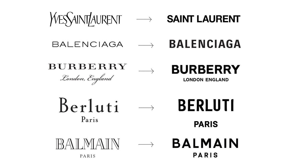
While not right for every brand, here are some examples of some very well known brands that have simplified their logos in the spirit of minimalism.
*This graphic circulated the web | Source: Twitter
As you can see, employing a minimalist approach can allow you to blend your logo and color schemes in a way that makes it easier for you to mix and match them with different graphics for ads and other purposes.


