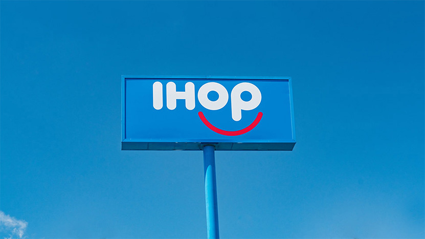
IHoP might have been due for a rebrand, but this wasn’t the one people were expecting.
So what exactly happened in the IHoP rebrand?
We have “rebrand” in quotation marks because it’s not truly a rebrand—it’s a marketing stunt. Without announcing the why, IHoP announced they were making a name change.
The internet guessed brunch, bacon, breakfast— all things you might expect from the International House of Pancakes. They ran polls. They replaced all “p”s with “b”s. Noted frozen pizza maker DiGiorno responded. Business and marketing publications freaked out. We guessed during our morning team meeting (our content marketing director was really, really banking on “Bloody Mary”).
And so when they revealed that the “b” stood for “burgers”, many people felt downright betrayed for all sorts of reasons.
This is a joke, right?
— Dan Pelletier (@Dantvman) June 11, 2018
Some feared losing pancakes entirely.
i hope you know the pancakes are still going to be there
— Jamilah (@jamilah44) June 11, 2018
Some came to their defense.
Dan ” I hate any kind of change! …* maybe if i say I’m taking my business elsewhere I’ll get free stuff!* IM TAKING MY BUSINESS TO DENNYS!” *Holds hand out for free stuff*… Dan, nobody cares about you or your business. Eat at home if you cant handle a restaurant expanding.
— AJ (@HyrulesChampion) June 11, 2018
Some felt they needed to step up their emoji game.
You missed a golden opportunity to use the emoji here…I’m not mad, just dissapointed. @Wendys definitely won this meme war
— Parker Allen (@parkerjallen1) June 12, 2018
And within a few days, it became clear that, in fact, IHoP was just trolling a bit. IHob would not be a permanent change.
But damn, are you going to remember they have burgers now!
So while we wouldn’t necessarily recommend actually carrying off a stunt like this, there are a few lessons we can take away from the IHoP rebrand.
A name change is going to make people feel feelings.
Even if you haven’t thought about IHoP in years, there’s a good chance you had a bit of an “excuse me?” reaction to this campaign. In fact, an audience can be pretty predictably divided between those who fully and completely embrace change and those who absolutely recoil from it. Either way, people take notice.
When and if your company does decide to rebrand, be prepared for the fact that yes, you’re going to alienate some of your audience. And you know what? That’s actually fine. You don’t have to be abrasive, but eliminating folks who aren’t going to be raving fans is actually very good for business.
If your branding looks like a well-known tampon… try again.
In this particular case, of course, the fact that that “ob” on the end looked an awful lot like a well-known applicator-less tampon only helped whip armchair designers and Twitter pundits into a frenzy.
But for your brand? You need as many honest human eyes on your new branding to make sure you don’t go to market with a logo that can’t be separated from another totally unrelated product.
Relief and familiarity can feel really good.
When it was all said and done, the IHoP rebrand probably left some people quietly rejoicing that something they hadn’t really thought about in a long time wasn’t actually at risk of being ripped from them. And that feeling will most likely translate to increased visibility and revenue.
For your brand, this can mean really emphasizing what’s NOT changing when you rebrand, reassuring your customer base that the things they love are still there and better than ever. You’re not betraying them with a total 180 degree change. It could also translate to using imagery, fonts, and other elements that SUGGEST familiarity—part of the reason vintage photography, fonts, and logos resonate is that they suggest an old comfort or familiarity. And trust.
We’ll be watching to see what the longer-term outcomes of IHoP’s rebrand might be, but in the meantime, what do you think? Let us know in the comments.


