A recent subscriber to our weekly branding newsletter asked us:
“HOW CAN I STAND OUT ONLINE GIVEN THE SHORT AMOUNT OF TIME PEOPLE SPEND ON A WEBSITE?”
To answer this question, I’m going to pull the Apple card.
It is not uncommon to hear my clients say that Apple is one of their inspirational brands. It’s certainly one of the brands that inspires me (as a brander), but also as a consumer of all of their products. (Side note: my only complaint is that they keep innovating! Just when you think you’re up-to-date with the latest technology, there’s another computer that’s better or faster). Case in point: Apple has a new MacBook Pro, which seems to have all the power of the Pro line, but the lighter weight of that of the MacBook Air! Brilliant. Just the other day I was talking about how I would love a MacBook Pro, but prefer my MacBook Air because I travel quite a bit.
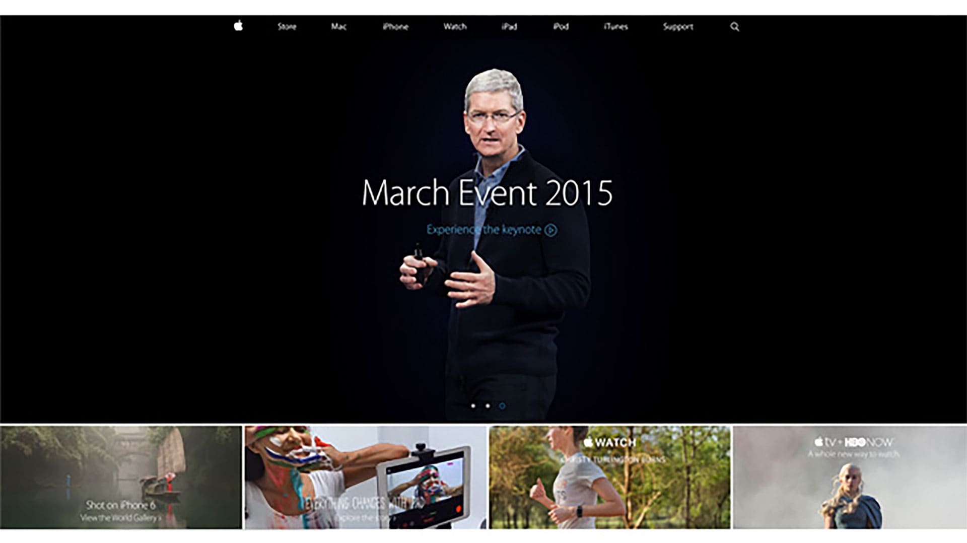
Okay, back to the topic at hand. Let’s look at Apple’s website to see what we can learn to address this question:
In my view, there are three takeaways from Apple’s branding approach that I believe applies to every entrepreneur or small business.
1. HAVE ONE CALL-TO-ACTION
Ask yourself, “What do you want viewers to do?” For many service-based entrepreneurs and small businesses, the call-to-actions are typically “Contact us”, “Order or Register” or “Sign-up for a Newsletter”. Whatever it is, define it — then build your website with that focus in mind. In Apple’s example, you might notice there are two call-to-actions but there is a PRIMARY (i.e., “Select a MacBook Pro” and a SECONDARY call-to-action (‘Ask Now’ – if you need to speak with an Apple Representative’). This is okay but keep in mind that there should typically be ONE PRIMARY call-to-action. Side note: make sure your call-to-action is ABOVE THE FOLD, which means the part of the page that’s visible without scrolling.
2. USE COLOR AND SIZE TO CREATE A HIERARCHY OF INFORMATION
Notice how the largest text size is a headline that introduces us to the main product line — The MacBook Pro family. The second largest text sizes are the labels for two different MacBook Pro products. Finally, the smaller text sizes are applied to the site navigation, pricing, shipping options, financing options, etc. In addition, color is another way to visually draw attention to your viewers to highlight something — especially a call-to-action. If you pay attention to the colors of the text, you’ll notice how the smaller text is grey while the call-to-action buttons are in blue color.
3. USE GOOD PHOTOGRAPHY/ IMAGERY.
As they say, a picture is worth a thousand words, right? So, Apple reminds us that photography is extremely powerful in communicating many layers of messages to your audiences — allowing us to see the quality and details of the product, even if we’re not able to touch the products from our computer screen. For entrepreneurs, this might be as simple as your bio picture/portrait — or the banners and graphics used throughout your site.
Ask yourself: are you choosing photography and imagery that communicates additional layers of your brand? Or, are you just using it to fill-up-space? I recommend using photography to help support what you’re trying to communicate and evoke and emotional connection with your viewers. [Refer to our previous blog post for an additional tip on photography].


