Have you ever looked for a listing of fonts by personality or wanted to know which typefaces are best for communicating different types of messages?
Below we’ve listed 23 different and distinctive fonts by personality, each of which tells its own story!
The most important thing to consider when looking at a font to match your brand’s personality and messaging is the history of the typeface, and its common associations throughout its lifespan.
Anyone can quickly determine how the public feels about a font by looking into how it has been used to communicate in the past.Just like we associate cowboy hats with the wild west, so too do we associate calligraphy with antiques.
Another quality to look for when picking the right outfit for your text is the font’s design! Is it bold, sloppy, geometric, or curvy? Is it wild and crazy or fare-free? Each of these attributes has its associated feelings, so use them to your advantage and create a comprehensive brand experience by choosing fonts that make people feel what you want them to!
And now — here is a primer on 23 font and everything you never knew you needed to know about them:
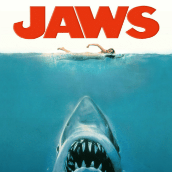

Amity Jack has been striking fear in the hearts of baby boomers for a long, long time. After all, it’s red and ALL CAPS. So this font might be for you if you are looking to inspire fear, awe, or courage. Bold, aggressive, and prominent: just like the shark of cult-classic fame.
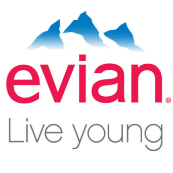
Combining the beginning of the alphabet and extreme simplicity has worked together to make this entirely forgettable font an easy-to-read staple of the design world. If “T-Shirt & Jeans” were a typeface, this would be it! An interesting side effect of this font’s simple personality is its all-too-common role in depicting virginal and pure brands, like evian.
This font’s been around a while. Quite a while, in fact. Developed in 1757 by printer John Baskerville, Ben Franklin brought this to the United States American colonies, where he used it in the Federal papers of the burgeoning government. Perhaps it’s no surprise that this font carries with it a personality of 260 years of tradition and authority.
If you are trying to be a trendsetting brand, then go big or go home with Bauhaus. This font gets high scores for being bold, funky, and even retro.
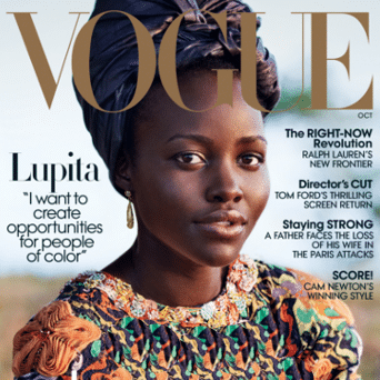
Named after a typographer employed by Italian nobility and Spanish royalty, this font has become another classic in the consumer world. You’ve likely seen it used with such brands as Vogue, Columbia Records, and even J.P. Morgan (although the JPM logo is based on another font). With clean lines, a storied history, and use by high-end and luxury consumer brands, this font has a sophisticated personality that aspires to be the best-dressed in the room.
Brush Script can be used when one wants to showcase a personal style and attitude. Its casual cursive is meant to display humanity and approachability.
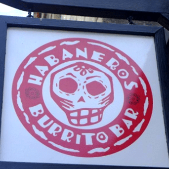
Yes, this font name seems a little on the nose. But, we’ll be honest; the problem with this font is that not only does it feel rough and uneven, but it also plays into a predictable stereotype from Hispanic culture.
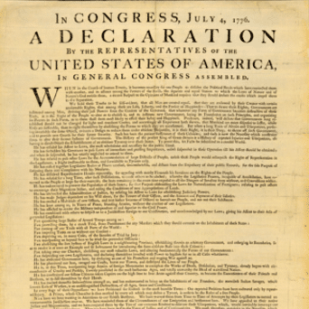
You might recognize this commonly used font from the Declaration of Independence. Simple, classy, with a touch of elegance, this font has understandably gone in and out (and in again) of fashion.

While not new by any means, this font continues to find relevancy when used repeatedly by many schools and brands such as The University of Michigan. You’ve no doubt seen this font grace letterman jackets in high school halls all across America and has become ubiquitous with education and sports. Strong, enduring, collegiate: it reminds us of our youth and early adulthood when possibilities seemed infinite, and football was everything.
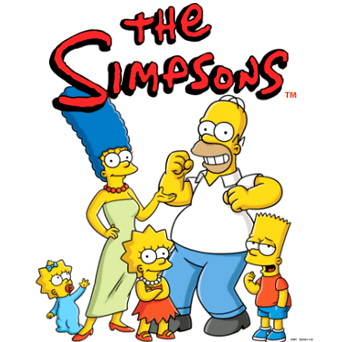
Proud-winner of “Most-Hated Font” by designers everywhere, this font first hit the streets around 1995 and, sadly, hasn’t looked back since. This font is looked upon as a laughing-stock everywhere it shows up. If you are going to swim in the waters of Comic Sans, we suggest you bring a life raft. This font is only appropriate for those with a unique sense of self-awareness and an appreciation for satire.
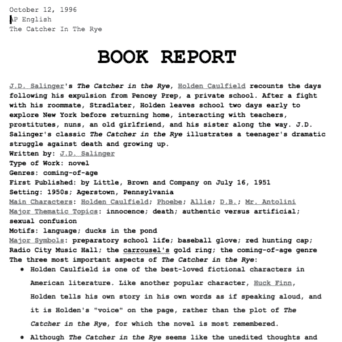
If you are an old-school character that likes to take up a lot of space, this is the typeface for you! All kidding aside, Courier is the go-to typeface of double-spaced term papers everywhere. As a result of this common application, this font has gained a renewed sense of purpose over the years. Commissioned by IBM, this is a thinker’s font and conjures up images of higher education.
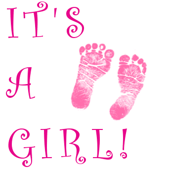
This favored “font to hate” echos middle school love letters with its near-bubbles over the letter “i” and circular flourishes—ideal for candy, ice cream, and pet-grooming shops.

An early foray into modern, bold fonts, Franklin Gothic makes a perfect outfit for an opinionated and wise person, who appreciates some subtly in their communications. Not quite as brash as a font like Bauhaus, Franklin Gothic is a happy medium for anyone looking to make headlines.
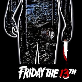
Yes, the font and movie title say it all. There’s a reason Michael Jackson’s Thriller used a similar typography. Thanks to Jason, this font will forever echo slasher-horror flicks where the last thing anyone should do is go outside to check out that noise. A little uncertain? Imagine the title of a nursery rhyme written in this font, perhaps Rock-a-bye Baby. Will that help you fall sleep faster, or check the closets first?
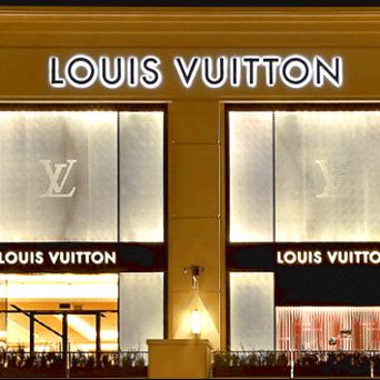
Variations of Futura (light, medium, bold, italics, condensed, etc.) are used in a wide range of logos and brands for a good reason: this font was designed in the late 1920s based on circles, squares, and triangles, omitting any clutter and unnecessary detail. Highly modern and radical at the time, it’s held onto that stylish, elegant persona even as it gracefully approaches 90 years old.

Gotham is one of the most recently designed fonts on our list, having come on the scene in the year 2000. Known as Barack Obama’s campaign slogan font in 2008, it is closely associated with change and sleek modernity. If you are attempting to evoke one of the most powerful men in the world, this could be the font to do it with.
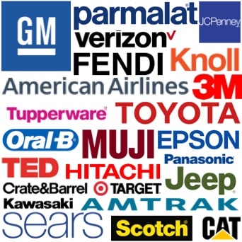
Perhaps the only typeface with a movie named after it, Helvetica has been showcasing world-class corporations such as BMW, Crate & Barrel, CVS, Energizer, GM, Harley Davidson, JCPenney, Jeep, Lufthansa, Mattel, Panasonic, Post-It, Scotch, The North Face and Toyota (to name a few) ever since 1957. Helvetica is the little black dress of typefaces, appearing everywhere and always fitting in beautifully. So if you need a classy outfit to suit any occasion and appeal to everyone, give this font a call.
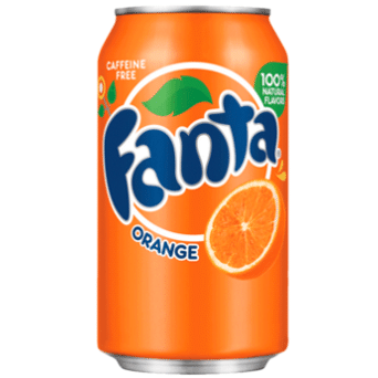
Fun, bubbly, and sure to make the trip to the dentist a little more interesting, this font gives off a youthful, cartoonish vibe. While an interesting choice for sure, be mindful of the impression the use of this font would give to your audience.
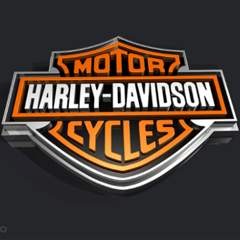
Tall, thick and bold are three words that sum up this title font. If much of what you say and do is meant to be front page news, you can’t go wrong with this showstopper.
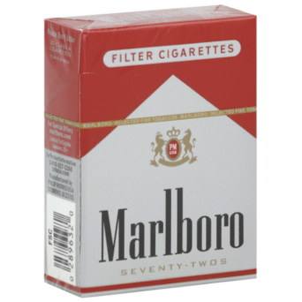
Not only did this font become canonized on a pack of cigarettes, it reminds even non-smokers of the Marlboro Man and the wide expanse of the west: Marlboro Country. If a masculine, rugged, warrior-hero cowboy is the image you want, this font may help. The hazards of smoking (and death of several Marlboro Men) hasn’t seemed to detract from this font’s cult-like reverence.
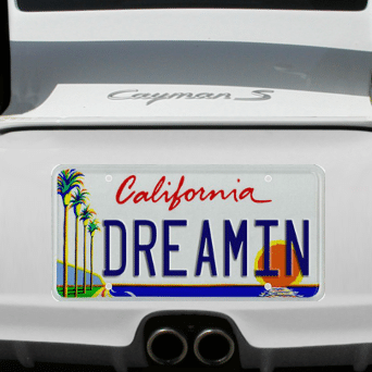
Visible everyday on the West Coast, yet perhaps out of thought, but definitely embedded into our subconscious. This font will forever be linked with the location stamped on license plates: sun, carefree, beaches. If your personality is a barefoot surfer, this font will burn that onto your forehead like skin cancer on a lifeguard.
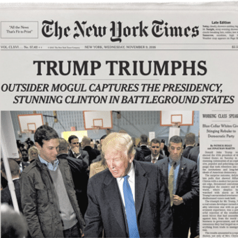
This font needs no introduction. It is a classic beauty, and perhaps the most read and renowned font in the world. When you need to appear as a classic authority with a strong foundation, Times New Roman is the perfect choice.
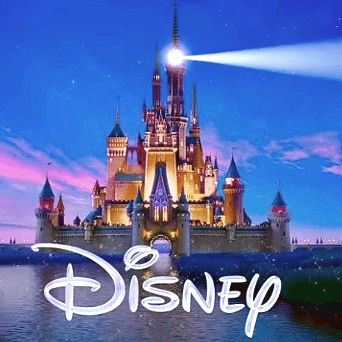
According to many, this iconic lettering is a stylized version of Walt Disney’s signature. After almost 100 years of the Disney brand longevity, this font will instinctively take on the ideals associated with the Walt Disney Company: family-friendly, fun, and, perhaps a little bit of an inner child.


