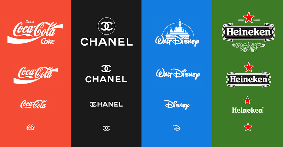
Responsive logos.
Responsive design, which detects the user’s screen size and optimizes display based on screen size, is a decade old. For a familiar reference point, Apple announced the iPhone in 2007. As touchscreens and tablets made their way into more and more homes, it was critical for the user to be able to actually see what was on their screen. Those of you who were carrying a BlackBerry before then probably remember squinting at a full-sized web page on a grainy screen.
Responsive design has been industry standard for quite a while. Logos, meanwhile, have not. But in 2018, brands like Coca-Cola, Chanel, Disney, and Heineken have created a suite of modern, simplified versions of their logo. Mobile optimization has become more and more critical to SEO, propelling this branding trend to the top of our list.
Animated logos.
Like responsive design, animated logos have been around for a while. Recently they’ve been popping up more and more. Animated logos are memorable and an effective way to tell a brand’s story, which can have a positive impact on conversion rate. You can see examples done by or for Shazam, Spotify, and this gorgeous tribute to artist and LGBT activist Gilbert Baker.
The return of serif fonts.
Sans serif fonts have been in the backseat for the last few years. Designers cited readability and a preference for flat design as reasons. Serif fonts are on their way back, thanks to improved screen resolution, larger phones, and the new options available through Google Web Fonts.
Fundamental geometric shapes.
Deceptively simple geometric shapes are in. 2018-19 will see geometric overlays used to create surprising possibilities for brands looking for a clean, modern look. Brands like thirdlove, zendesk, and Rush Talent all make use of this branding trend.
Fun!
Colorful logos with funny elements, animation, and custom illustrations are a big trend this year. Brands want to send a positive message to their customers, and there’s nothing more positive than fun. The bold colors and geometric patterns of the 80s and 90s transport the customer back to fun, Fast Times vibes. Check out the bright, brash branding used by Wing Wing, Otherland, ban.do, or, you know, that iconic Solo Jazz cup from the 80s.
Overlaps.
With the duotone/double exposure trend rising, overlapping elements are super-hot in logo design this year. Ranging from slightly hallucinogenic shift logos to simple overlaps, we can expect to see more of this branding trend in 2019.
Grid-Based logos.
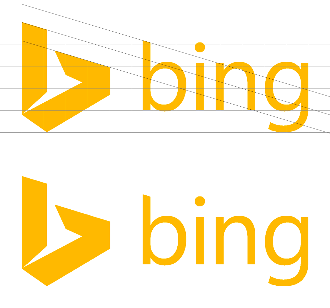
Grids have the power to portray logic, theory, control, and perfection. In a sense, it’s a trend that’s never ended—only come and gone in waves. Based on designs we’ve seen of late, we can expect a healthy serving of very obvious grids in logo design this year. Check out Uber and Bing for examples of grid-based logos

From the latest branding trends, What’s been catching your eye lately? Let us know in the comments!


