You see these logos everyday. But do you really see them?
They are some of the most recognizable symbols on the planet. They are recognizable in different languages and cultures throughout the world. But how does a symbol communicate the same brand promise across different languages?
The answer lies in sophisticated simplicity. It’s a concept that we, at BRANDING FOR THE PEOPLE, believe in and value.
Put another way, logos communicate their brand promise conceptually via design in subtle, yet powerful ways.
After we point these hidden meanings out to you, you won’t ever be able to look at these logos the same way again….
1. FedEx
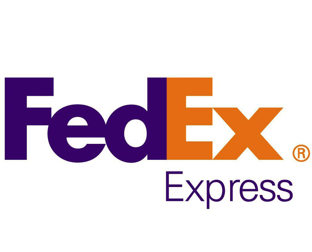
At first glance, this seems to be a relatively straightforward logo. Big block letters, “Fed” in purple, “Ex” in orange.
But look a little closer and you will see an arrow in the blank space between the “E” and “X.”
An arrow knows where it’s going, it’s pointing right at it! It’s always on to the next thing, it’s fast, and has direction as their brand promise.
What better symbol for “express” than an arrow? The logo is simple, but it knows what it is and where it is going, and what better traits for a shipping company to have than speed, simplicity and reliability? These are all traits that this logo does a wonderful job of communicating through design.
2. Milwaukee Bucks
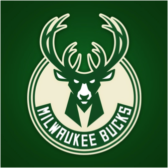
In case you aren’t a basketball fan, the Milwaukee Bucks are the professional basketball team from, you’ll never guess, Milwaukee! And their new logo is pretty sweet.
First of all, that deer is downright scary. That’s not Bambi, that’s Bambi’s ass-kicking older brother. Bambo (Rambo, but the deer… get it? Ba-dum—chishh). I’m not sure what the deer’s actual name is but the point is that deer is fierce, and as the logo for a competitive sports franchise, a fierce logo is a good one. You don’t want to play these guys.
But look a little closer and you will see some subtle design elements that make this logo really stand out. The first is that the horns silhouette the seams of a basketball. It’s subtle, but the basketball imagery is there. After all, this is the logo for a basketball team, not a deer sanctuary, so it’s important to connect the logo to the sport.
The next cool feature of this logo is that the neck of the deer forms a jagged “M.” Not just any M either, that “M” is reminiscent of a superhero badge, like batman’s bat symbol. The Bucks even use that “M” as a stand-alone logo in its own right, adding more diversity to the logo. What better way to support your team than with a giant emblazoned super M across your chest just like the superman “S”?
Lastly, the color scheme is great for the mascot. They went all in on forest green, which works cohesively with the mascot of a “buck” which calls the forest its home.
3. Amazon
This is perhaps the most famous example of “hidden” imagery. It’s not that hidden really, but subliminally it is very powerful.
Selling and delivering everything from “A” to “Z” with a smile as their brand promise. The arrow from the “A” to the “Z” forms a smile and a dimple, creating a warm, friendly, and inviting logo. What could be better for the largest online retailer in the world?
4. Baskin Robbins
Baskin Robbins is famous for having 31 flavors of ice cream, it’s their key differentiator. They have variety and they want you to know it at all times, even when they aren’t explicitly saying it.
This logo does a powerful job of using color to highlight the fact that they have 31 flavors. Don’t see it? Just focus on the pink and you will see that the pink parts of the “B” and the “R” make up the number 31. Pretty cool, huh?
5. Le Tour De France

The most famous bicycle race in the world, but do you see the bicycle?
The back wheel of the bicycle is the first “o” in tour, with the “r” forming the rider who is bending over the front, yellow wheel. The “u” serves as the seat of the bicycle.
This image of a bicyclist let’s you know that Le Tour De France is a bicycle race no matter what language you speak, important for an international bike race, and the quick, brush stroke font looks like it was done in hast, written as quickly as the racing bikers.
A strong logo stand out and looks good doing it. It catches your eye, but a great logo communicates the brand’s promise conceptually.
I urge you to think about what your logo says about
, and to think about if there is any way your logo can better communicate your brand’s promise through its structure, color, and design.


